As the design team at Innova Creative, we analyze digital behavior and aesthetics every single day. We are observing a fundamental shift: users are tired of soulless, sterile, template-built websites. Websites that look identical no longer build a competitive advantage. In a world where content is generated in an instant, unique and sophisticated design is the strongest proof of your brand's quality and credibility.
In 2026, professional web design is not just about "pretty layouts." It is a blend of visual psychology and technological excellence. A website must not only convey information but evoke emotions — making users want to stay, click, and explore. Let's look at the three major trends shaping the world's best digital projects today.
1. Deep Minimalism and Glassmorphism 2.0 (Frosted Layers & Micro-Glows)
Traditional flat design is a thing of the past. Instead of flat blocks, modern interfaces use layered depth. We call this evolution Glassmorphism 2.0.
Key features of this trend include:
- Frosted Glass Effect: Interface elements (cards, menus, modals) look like sheets of semi-transparent glass, softly blurring the content underneath. This creates an elegant sense of physical space.
- Micro-Glows: Instead of harsh, colorful backgrounds, we use soft, glowing shadows with subtle color tints (e.g., warm orange or cool blue) around the edges of cards. These micro-gradients make the interface feel alive.
- Ultra-thin Borders: Divider lines are just 1-pixel thick and often feature a gradient finish, giving the designs a precise, high-end feel.
2. Interactive 3D and Framer Motion Micro-interactions
In 2026, static websites are perceived as outdated. Modern websites respond to every movement of the user. This is not about chaotic flashing elements, but incredibly smooth, natural micro-interactions.
Using modern animation libraries like Framer Motion alongside the Next.js framework allows us to implement rich animations without sacrificing website performance. Elements seamlessly appear as you scroll, cards gently tilt to follow your mouse cursor (parallax tilt effect), and buttons react to hover with elegant transitions. Users subconsciously associate this fluid performance with professional reliability.
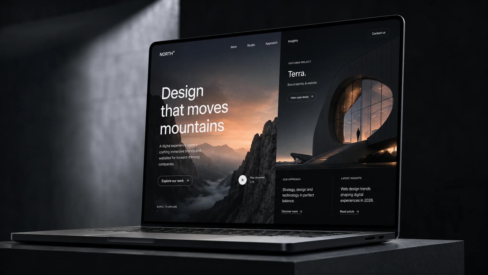
3. Dark-First UI as the Premium Standard
While light themes still have their place (e.g., for heavy text portals), premium niches, SaaS startups, creative agencies, and modern B2B brands are overwhelmingly adopting a Dark-First UI approach — where dark mode is the default and primary style.
A dark backdrop provides spectacular contrast for visuals, product mockups, and interactive elements. Furthermore, dark interfaces are much easier on the eyes during prolonged screen time. The dark aesthetic naturally conveys prestige, innovation, and exclusivity.
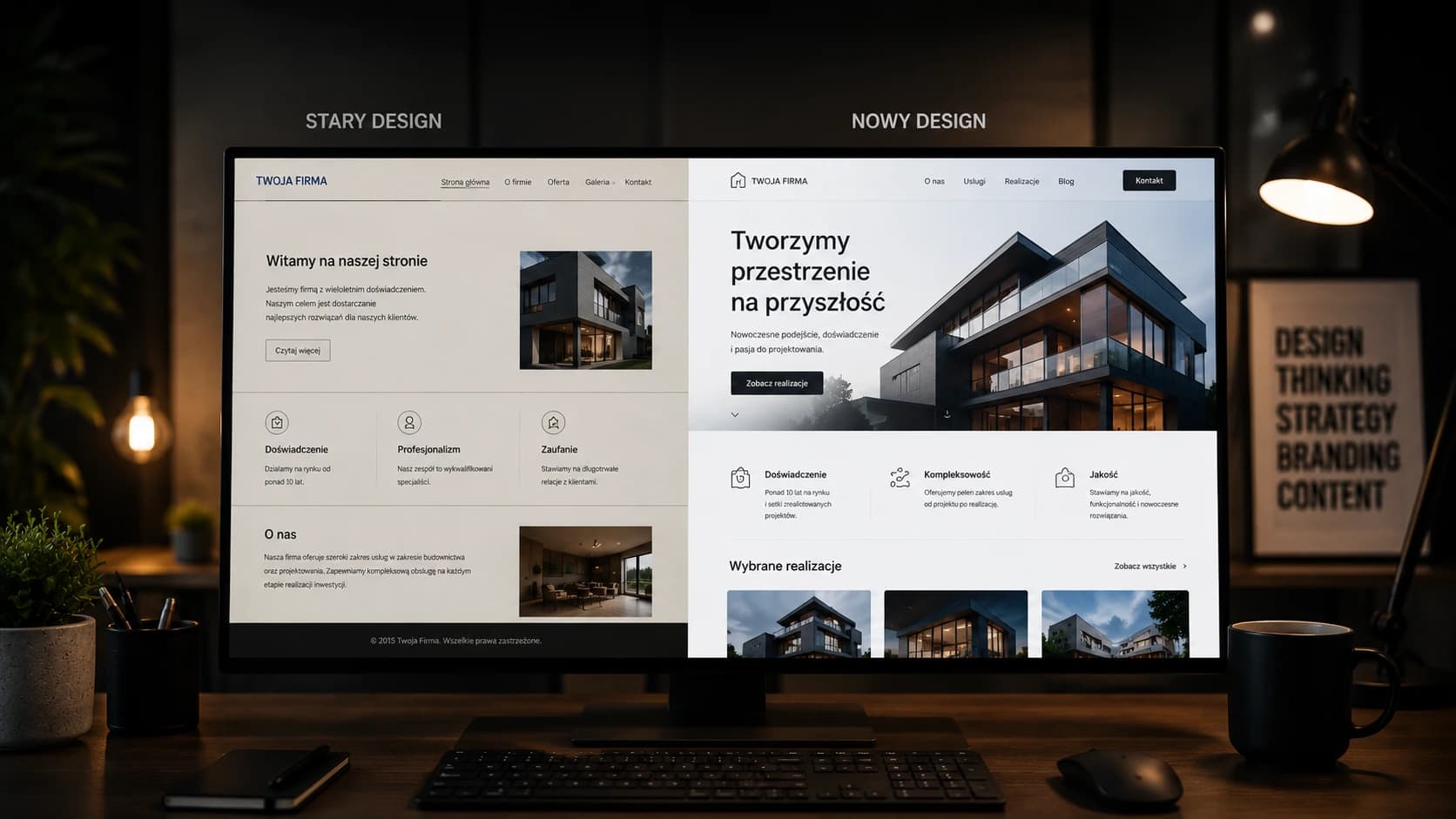
Comparison: Old Web Design (2022-2024) vs. Modern Standard (2026)
| Website Aspect | Outdated Style (2022-2024) | Premium Standard (2026) |
|---|---|---|
| Layout (Grid) | Rigid, symmetric grids and boxy, repetitive sections. | Asymmetric, fluid grids with dynamic, layered depth. |
| Visual Assets | Flat, generic vector graphics bought from mass stock sites. | Three-dimensional (3D) renders, customized art, and authentic media. |
| Movement | Static designs or abrupt, simple hover state jumps. | Ultra-smooth micro-animations with natural physics (spring animations). |
| Typography | Standard, boring sans-serif system fonts. | Bold, elegant serifs in headlines matched with geometric minimalism. |